CASE STUDY: BAY EQUITY
Big branding doesn't need to cost your personal relationships.
A new home for Bay Equity.
You're the rare bird in your industry—a family-run mortgage company operating on a national stage. You need a brand that lets you flex those family-run roots while inspiring big-league confidence.


HOW TO GET AFTER IT:
Own the people-first approach that sets you apart.
Embrace that lovely DNA.
Then craft a new brand, site, and communication tool to give it life.
Basically, give the customers what they need.
But stay true to you.
But stay true to you.
Strong results start with a strong
STRATEGY
Put yourself in the shoes of a new homebuyer or a seasoned homeowner looking for a change of scenery. Each audience faces a unique problem—
but who's best equipped to lend a hand?
but who's best equipped to lend a hand?
Answer:
The personable Loan Officers at Bay Equity.
The personable Loan Officers at Bay Equity.
So, our team decided a two-
environment site was the ticket.
environment site was the ticket.
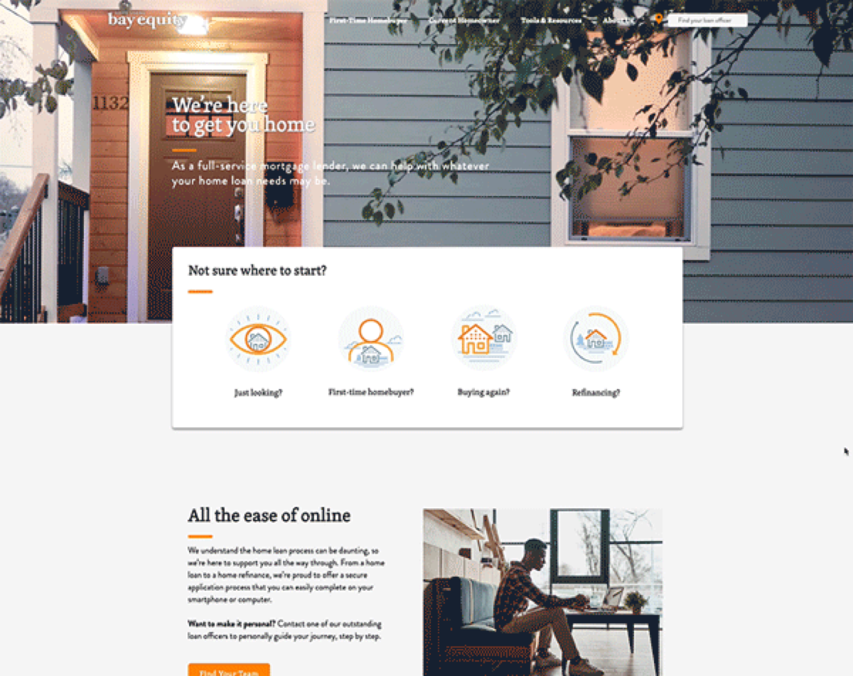
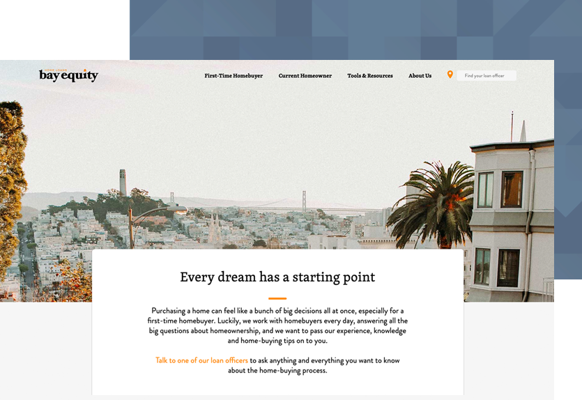
One constructed to get each audience settled, educated, and quickly in touch with their Loan Officer.
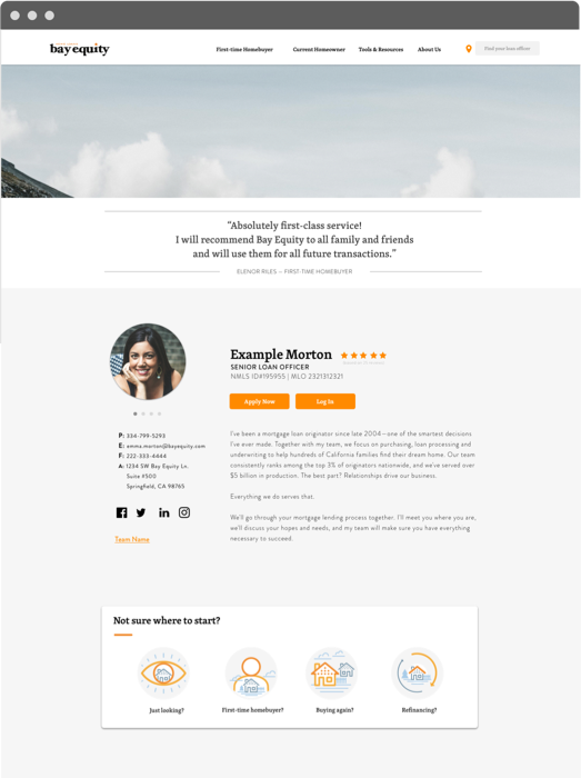
One constructed to give Loan Officers a customizable space to showcase the person behind the professional.
Actualizing ideas takes real-world
TECH
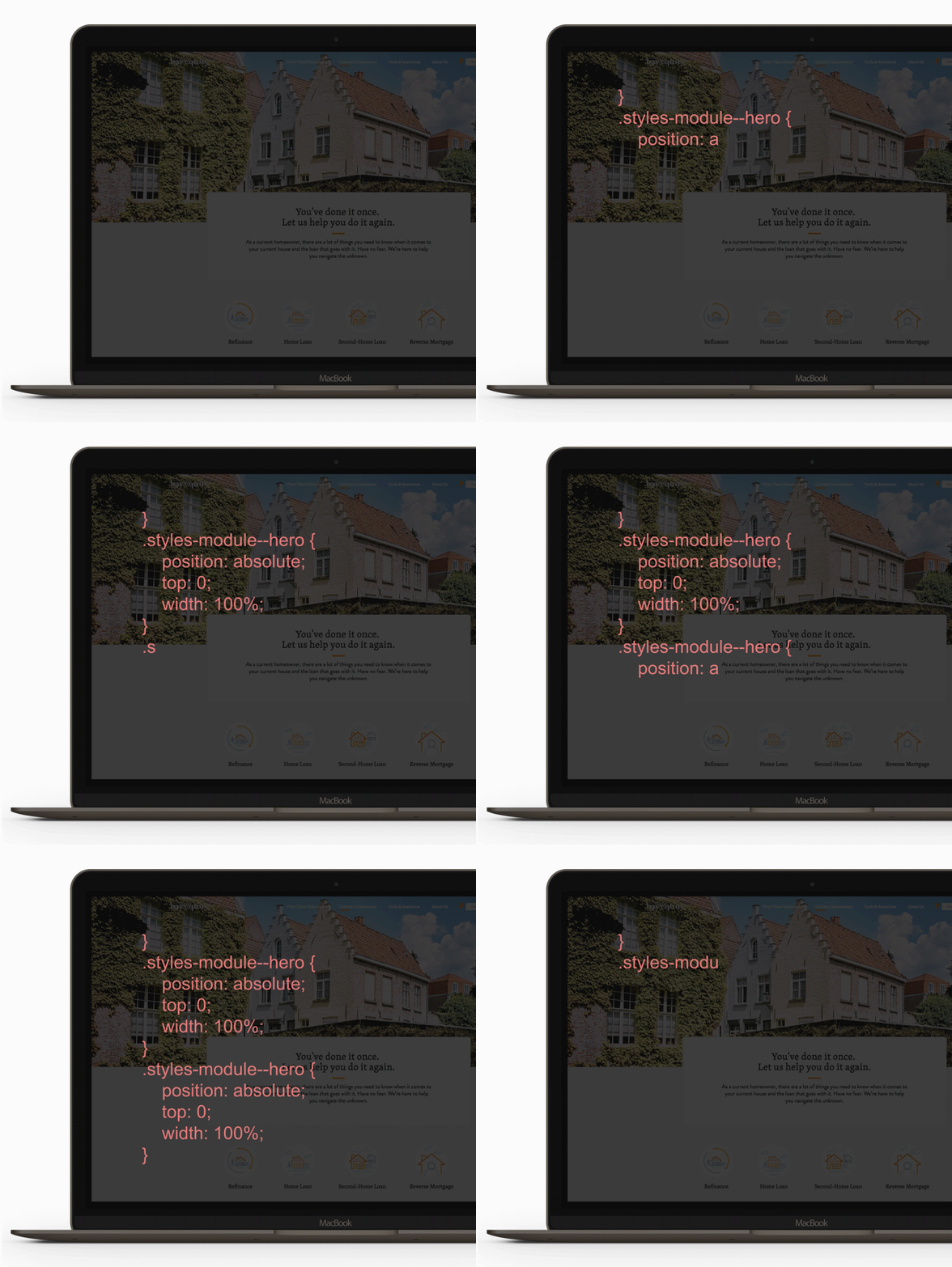
Created a fast-to-download, easy-to-update website by separating content management from website delivery.
Content is authored by a robust CMS and stored at GitHub—then built into a static site hosted on a global CDN.
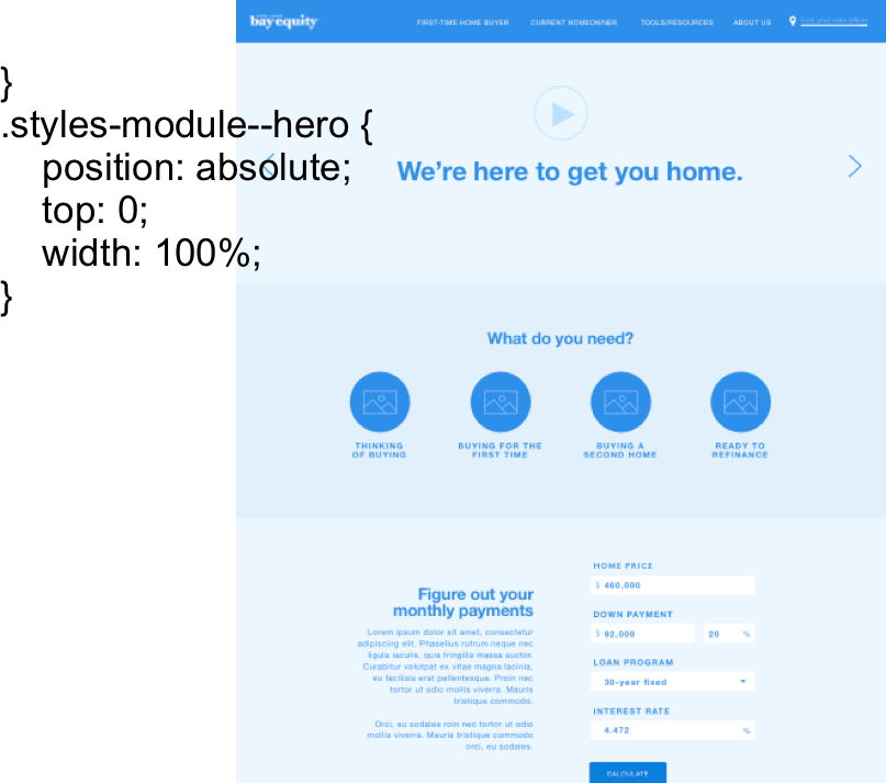
Dynamic features are provided by lightweight, serverless APIs, providing a stable, always-on environment with no up-front infrastructure costs and maximal technical flexibility.
Best-laid plans thrive with best-best
CREATIVE
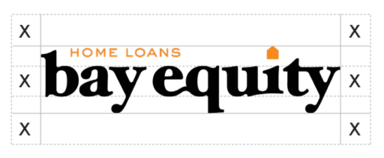
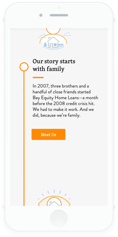
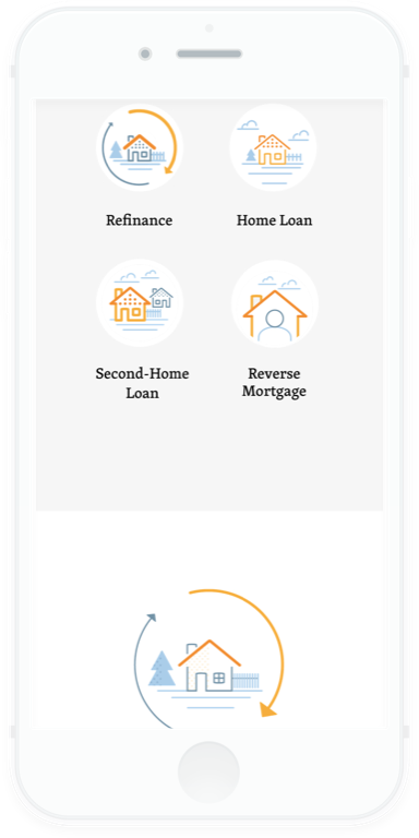
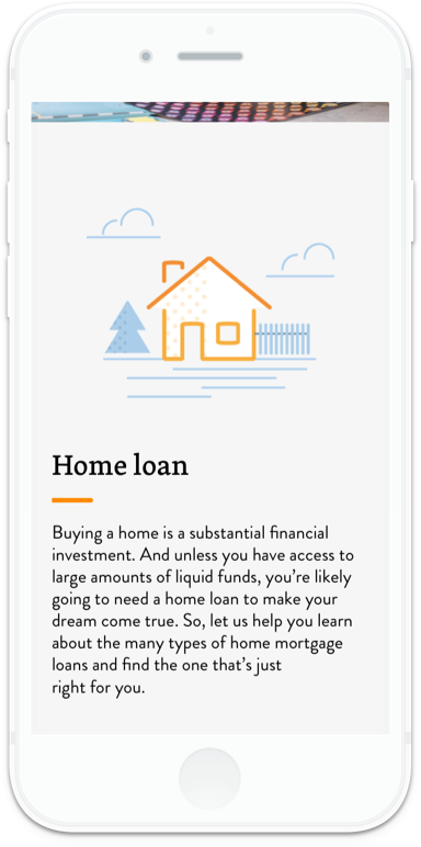
Refreshed logo, brand colors, and iconography, giving them a sophisticated-but-approachable persona.

Developed a tone that was trustworthy, inspiring, and thoughtful. The content was always useful—but the Loan Officer was always the destination.

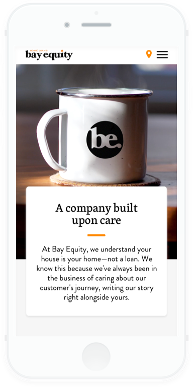
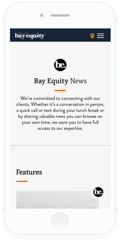
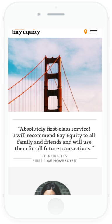
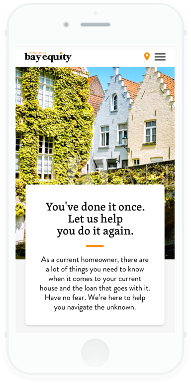
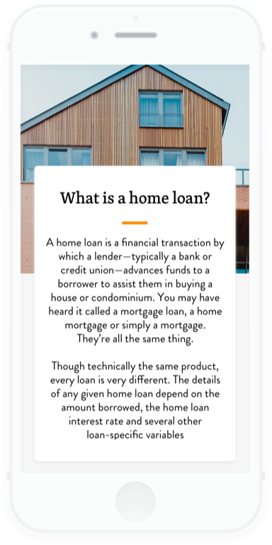
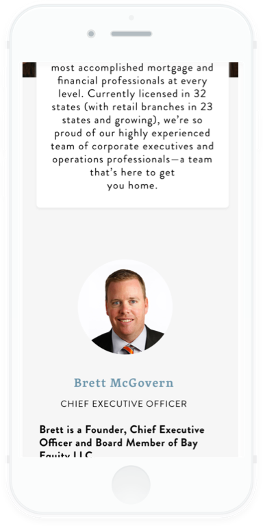
Designed a clean, modern website.
Parallax, cinemagraphs, and dynamic content all work together to communicate "tech‑forward" without having to say it.
HOW IT WORKED OUT:
Thesis launched a refreshed brand and from-scratch website. True to Bay Equity's culture of personability, each piece resonated with stakeholders and customers alike. Meanwhile, 300+ Loan Officers are positively giddy about their customizable personal pages.
Credits
Thanks to the Bay Equity Team. AKA the real people who made the real work.
Account/Project Manager: KC Anderson
Strategist: Cher Fuller
SEO: Nathan Stenberg
Designers: Allison Bowe, Gus Nicklos, Grant Stewart, Dala Botha
Writers: Tyler Stenson, Spencer Foxworth, Tyler Hively, Elizabeth Harney
Developers: Michael Barrett, Sonya Trachsel, Alex Liang, Spencer Malone, Cemal Richards